
Design Basics Made Visible
Practice the first decisions behind clean graphic design: layout, typography, color, spacing, image placement, and simple checks that make a visual piece easier to read.
What Learners Notice
I used to fill every canvas with text and icons. The spacing checks helped me remove clutter and make a poster feel easier to read.
The typography practice made font pairing less random. I learned to adjust size, weight, and line height before adding another typeface.
Color felt confusing at first, but comparing versions and checking contrast gave me a clearer way to decide what actually works.
Where Layout Starts To Make Sense
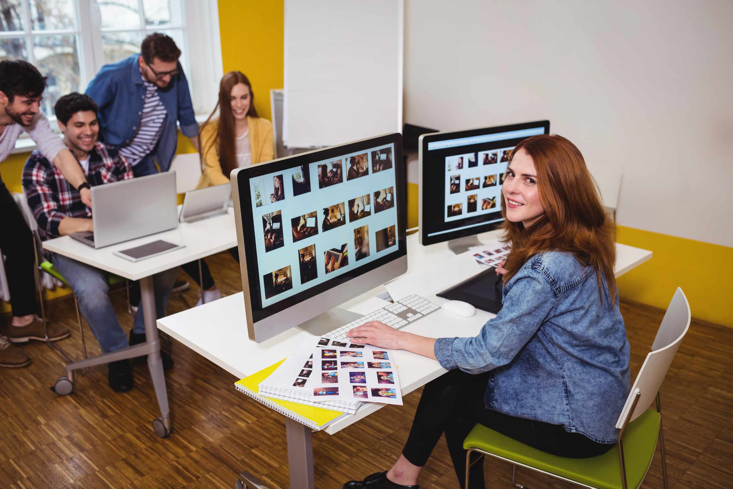
VisualCore Course focuses on the fundamentals that make beginner design work easier to judge: visual hierarchy, alignment, white space, contrast, and readable type.
Instead of adding effects too early, learners practice small design choices on posters, banners, social graphics, and simple mockups, then review what changed.
Layout Basics
Type And Color
File Cleanup
Practice The Core Design Pieces
Work through the parts that usually make early designs feel crowded, flat, or hard to read.
Poster Layouts
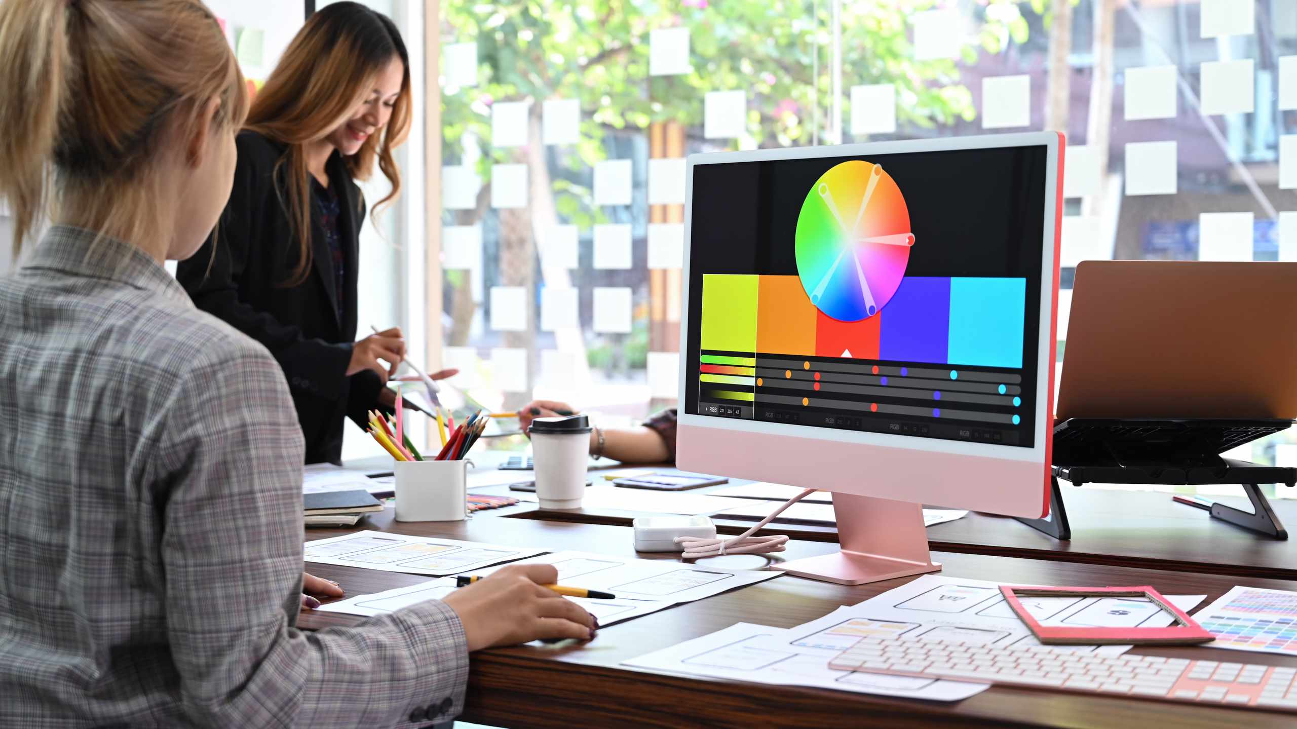
Arrange a headline, image, and text block on one canvas while checking margins, hierarchy, and breathing room.
Social Graphics
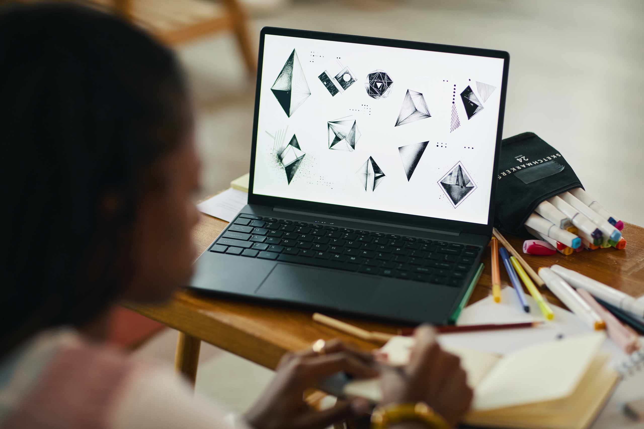
Build small visual pieces where crop, contrast, scale, and short copy must work together quickly.
Design Reviews
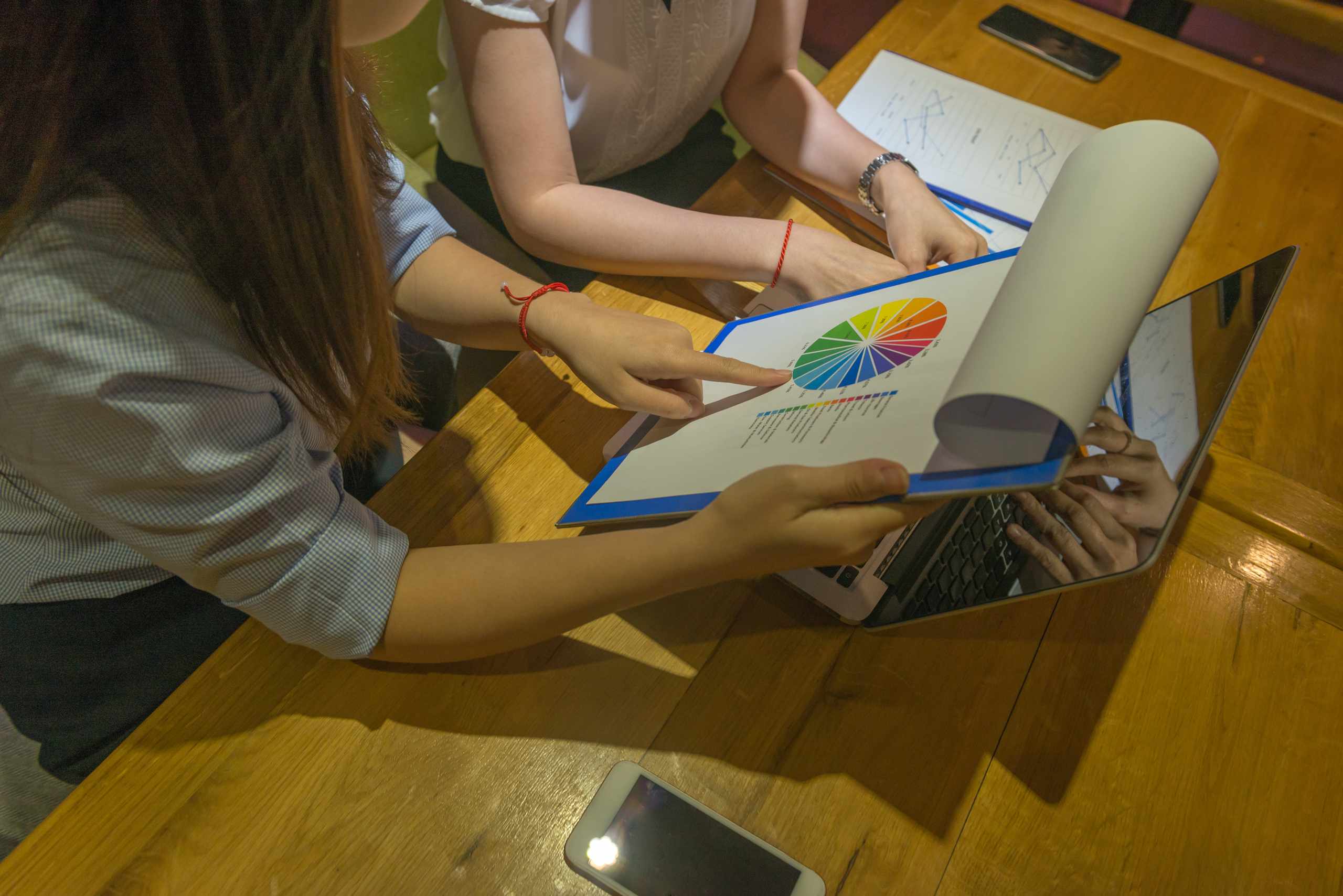
Compare versions, remove weak decoration, and use clear checks instead of relying only on personal taste.
Design Notes For Early Practice

A Simple Method to Validate Your Graphic’s Visual Hierarchy Prior to Export
Is it possible for someone to grasp the gist of your graphic within a mere few seconds, bypassing the necessity…
Read More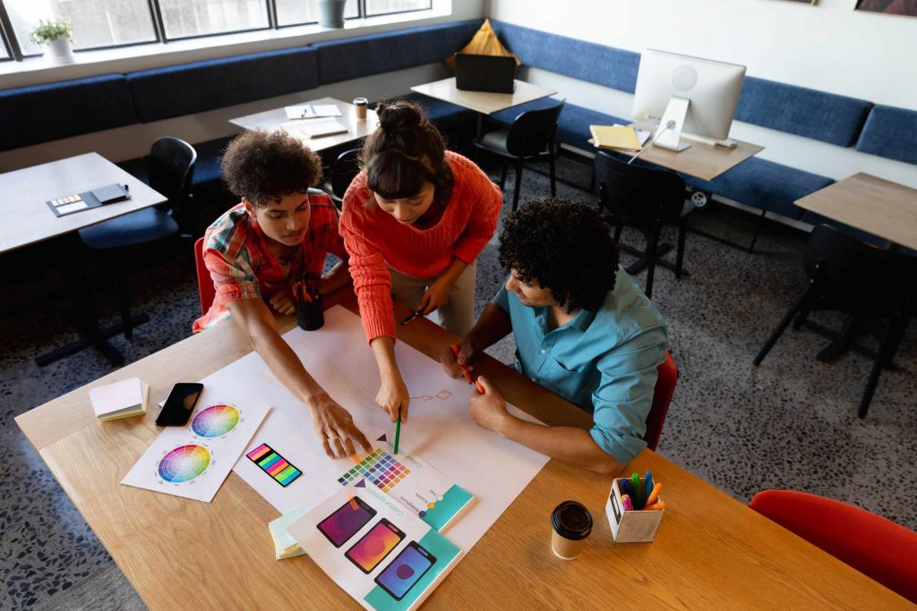
How to Select Two Fonts That Pair Well Together in a Minimal Design
Two fonts can be enough to design a poster, banner, or social media visual, but their roles should be clearly…
Read More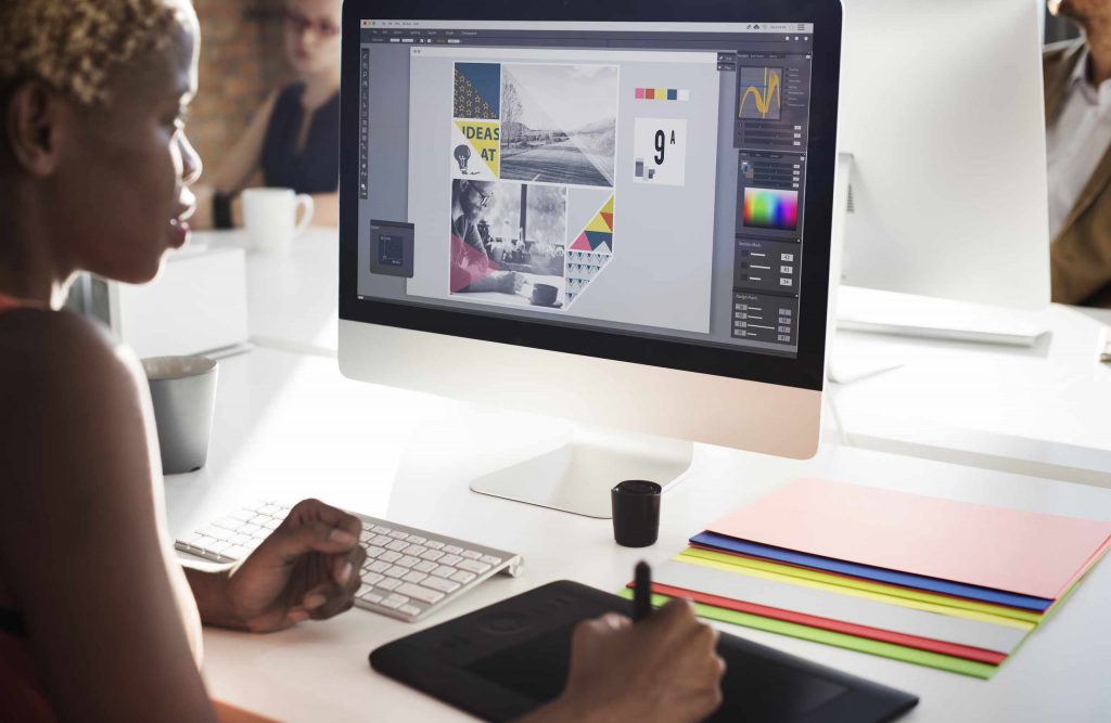
Why Spacing Matters Before Adding Colors or Effects
Don’t reach for colors or effects just yet; look first at the spacing. Spacing isn’t just wasted space. Spacing is…
Read More